
You have no items in your shopping cart.
0item(s)
You have no items in your shopping cart.
Now, meet the n![]() ew EcoZoom. The idea for this logo came about by accident, like many other amazing ideas. Here’s the story…our original typeface was too long to emboss on our stoves in one line. So, we had to break it in two. Then one of our vendors noticed that the Os in EcoZoom were lining up like the stones used in a three stone fire.
ew EcoZoom. The idea for this logo came about by accident, like many other amazing ideas. Here’s the story…our original typeface was too long to emboss on our stoves in one line. So, we had to break it in two. Then one of our vendors noticed that the Os in EcoZoom were lining up like the stones used in a three stone fire.
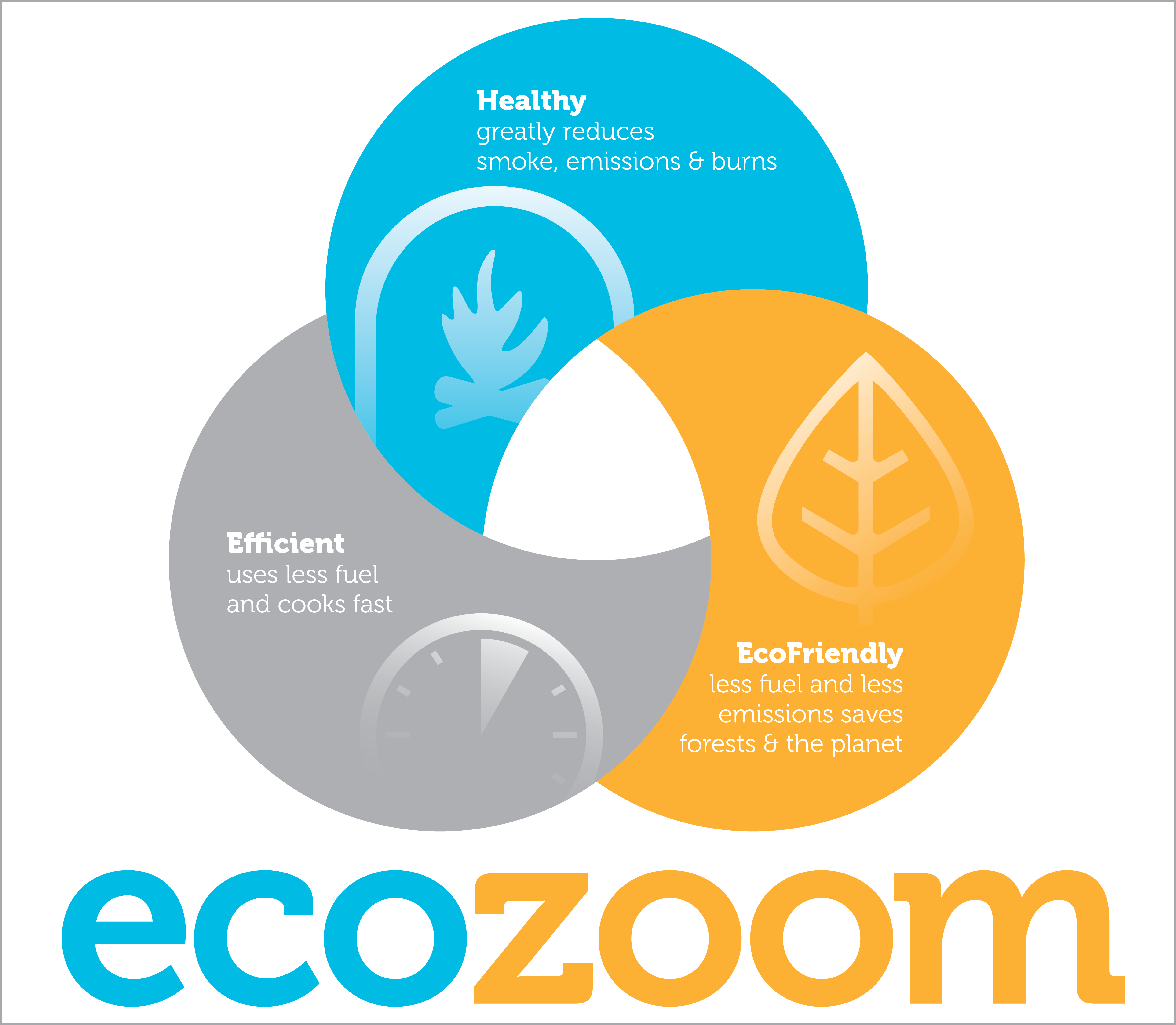
 At first we just thought it was funny. But then we got thinking about the three Os in EcoZoom, the three stone fire (which we’re trying to displace), and our triple bottom line as a company (people, planet and profits) and it clicked. We need these ‘three dots’ to tell our story.
Thus the idea and motivation were born but it was over a year later before we implemented. Now, the new look and feel of EcoZoom is in full swing in Kenya and getting there in other markets like the US. We’re even using it to market to end consumers.
After some time in the cookstove game and a bunch of focus groups with cooks we honed in on how we wanted to communicate the benefits of our products to end consumers. And guess what…we found three primary benefits to communicate. Three again! Now, cooks around the globe are learning how EcoZoom stoves are healthy, efficient and ecofriendly.
At first we just thought it was funny. But then we got thinking about the three Os in EcoZoom, the three stone fire (which we’re trying to displace), and our triple bottom line as a company (people, planet and profits) and it clicked. We need these ‘three dots’ to tell our story.
Thus the idea and motivation were born but it was over a year later before we implemented. Now, the new look and feel of EcoZoom is in full swing in Kenya and getting there in other markets like the US. We’re even using it to market to end consumers.
After some time in the cookstove game and a bunch of focus groups with cooks we honed in on how we wanted to communicate the benefits of our products to end consumers. And guess what…we found three primary benefits to communicate. Three again! Now, cooks around the globe are learning how EcoZoom stoves are healthy, efficient and ecofriendly.
 Depending on what market you’re in, you’ll see the new EcoZoom come about at different times. But, by 2014 it will be full swing in all markets and some exciting new products will be introduced that also embody our new look and feel. Stay tuned!
Out with the old...
Depending on what market you’re in, you’ll see the new EcoZoom come about at different times. But, by 2014 it will be full swing in all markets and some exciting new products will be introduced that also embody our new look and feel. Stay tuned!
Out with the old...


← Older Post Newer Post →